QR Code Card Design: 7 Rules That Triple Guest Photo Uploads
The same QR-code platform with the same audience gets 15% participation with one card design and 85% with another. The seven design rules that decide which side you land on.
The same QR-code platform, the same guest list, the same evening — one card design gets 15% of guests scanning, another gets 85%. The variables sit on the card itself: size, contrast, headline, placement context. Get the seven things below right and you triple the upload rate without changing anything else.
This is the practical reference for designing QR cards that actually get scanned. The numbers come from real wedding and corporate event data, the print specs come from QR-code standards, and the photo references come from cards that worked vs. cards that didn't.
What makes a guest scan
Guests are not actively looking for ways to upload photos. They are sitting at a table during dinner, glancing around between courses. The card has about 2 seconds to do four things:
- Tell them what scanning will do ("Share your photos with the couple")
- Make scanning physically possible (size + contrast + camera focus distance)
- Feel safe (this isn't a marketing scam or a phishing link)
- Feel worth doing (clear benefit, low effort)
Cards that nail all four convert 60–85% of guests. Cards that miss any one of them drop participation by half. Below is what each rule looks like in practice.
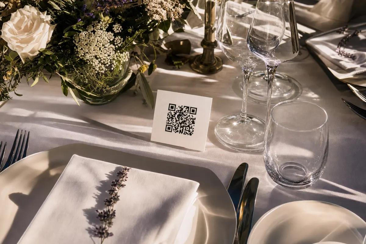
Rule 1: The QR code itself must be at least 4 cm
The single most common reason for low scan rates is QR codes printed too small. Phone cameras need a minimum physical size to focus on a QR code at typical reading distance (30–50 cm).
Working sizes:
- Table tents (read at 30 cm): 4×4 cm minimum, 5×5 cm comfortable
- Standing cards / placecards (read at 50 cm): 5×5 cm minimum
- Entrance posters (read at 1.5 m): 15×15 cm minimum
- Wall posters (read at 3 m): 30×30 cm minimum
A real example: a Bergen wedding venue used 1.5 cm QR codes on their menu cards. Scan rate: 18%. They reprinted with 4×4 cm codes the next event, same design otherwise. Scan rate: 71%.
The QR-code physical size is set by the printable area you give it. The amount of data the QR encodes (URL length) also matters — longer URLs need denser QR patterns and more physical space to remain scannable. The GS1 standards on QR-code dimensions and quiet zone cover the math. Or just keep your gallery URL short and use 4×4 cm cards.
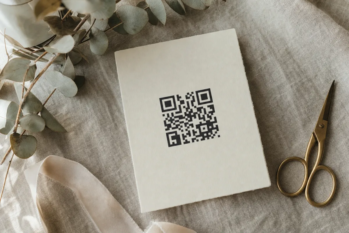
Rule 2: Black on white still beats every other combination
Designers want to use brand colors for the QR code itself. Don't. The single best contrast for scanning under variable restaurant lighting is black on a white background. Everything else loses some percentage of scans.
What works:
- Black QR on white background — 100% baseline
- Dark navy or dark purple QR on cream — about 95% of baseline
- Dark grey QR on white — about 90% of baseline
What doesn't:
- Light grey QR on white — drops to 30–50%, wedding venues are dim
- Any color on a photographic background — drops below 20%
- Inverted (white QR on dark) — works in some apps but breaks in others
If you must use brand color, apply it to the card border, the headline text, and the icons around the QR. The QR itself stays black on white. The W3C WCAG 2.2 contrast guidance sets the same principle for accessibility — function first, brand second.
Rule 3: One specific headline that says what happens
"QR Code" tells the guest nothing. "Scan Me" is slightly better but vague. The headline that converts is one short benefit sentence:
- "Share your photos with us" (wedding)
- "Add your photos to the conference album" (corporate)
- "Drop your party pics here" (birthday)
Pair the headline with one supporting line: "Point your camera at the square — no app needed". That second line is the single most effective bit of microcopy for guests over 60 who aren't sure what a QR code is.
What to skip:
- Three lines of text — guests don't read three lines on a table card
- Hashtag-style phrases ("#OurBigDay" without explanation)
- Brand voice without function ("A moment captured forever")
Rule 4: One small instruction icon
Older guests do not always know that opening the camera app, pointing it at a square, and tapping the notification will load a webpage. A small three-step icon strip removes the uncertainty:
- Camera icon
- QR code icon
- Upload icon
Three icons in a row, each 1 cm tall, under the headline. Cheap to add, measurably increases participation among guests aged 60+. The Canva templates in our free QR card templates include this strip pre-laid-out — easier to keep it than rebuild it.
Rule 5: Brand around the QR, never inside it
The temptation: put your wedding monogram or company logo in the center of the QR code. Some QR generators support this. Resist.
Logo-in-center QR codes work in good lighting on flagship phones. They fail in dim restaurant light on three-year-old Android phones. Wedding guests are often using exactly that combination. Branded "stylized" QR codes lose 20–40% of scans.
Where brand goes:
- The card border and color palette
- The event name above the QR
- The supporting iconography
- The card stock and finish
- Decorative elements around the perimeter
Not on the QR itself.
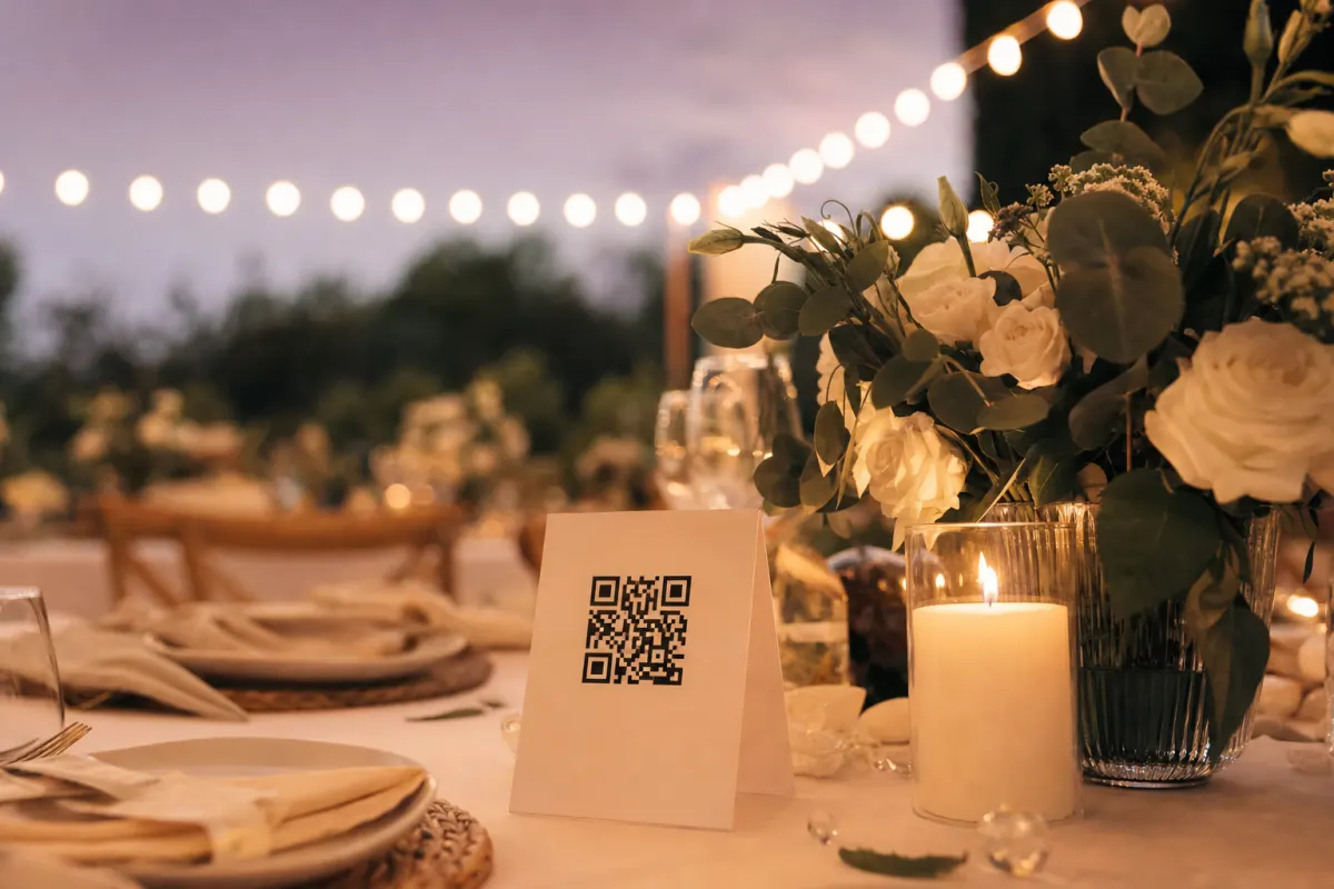
Rule 6: One card per six seats, plus an entrance sign
Placement is part of card design. The two highest-scan placements:
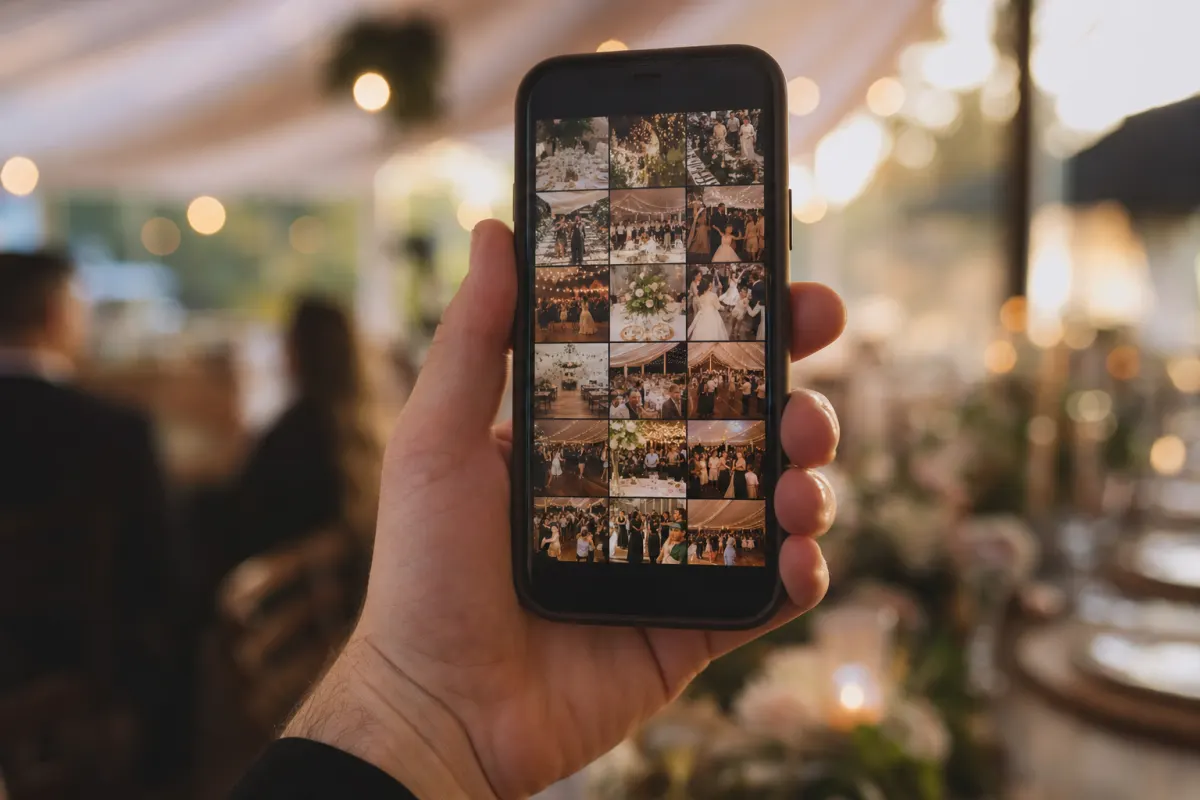
Dinner table cards (one per six seats minimum). At a 60-guest wedding with 10-person tables, six cards. At a 200-guest corporate event with 8-person tables, 25–30 cards. Each card is 8×8 cm folded table tent with QR on both sides. Cards on the table generate roughly 70% of total scans because guests look at the table for hours.
Entrance sign (A2 or A1 size, 15×15 cm QR minimum). This catches guests as they arrive, often before they sit down, and produces another 15% of scans.
The remaining 15% comes from program inserts, the bar area, the bathroom mirror, and the post-event email. Skip a single placement and you'll lose roughly that share of uploads.
Rule 7: Test under venue lighting before printing 200
Print one card. Take it to the venue (or to any restaurant with similar lighting). Try scanning with three phones:
- A current iPhone
- A 2-year-old Android
- The oldest phone someone in your family has
If any of the three struggles in 5 seconds, the card is not ready. Common fixes:
- Increase QR size by 1 cm
- Switch from cream to white background
- Reduce URL length (use a custom short link)
- Move the QR away from any reflective foil/metallic ink
Five minutes of testing prevents a printed batch of 200 cards that nobody can scan.
Common design mistakes that look fine but break scanning
- QR placed over a photographic background — looks elegant, breaks scanning. The QR needs a clean rectangular background. White is best, solid pale color is okay.
- Trendy fonts on instructions — guests can't read script-fonts at table-card size in dim light. Stick to a clean sans-serif at 10–14 pt.
- Foil or metallic finishes on the QR area — looks premium, reflects light into the camera, drops scan rate by 30%+.
- Too many words — five lines of text on a 8×8 cm card means nobody reads any of them. Headline + supporting line + QR + three icons. Stop there.
- Reusing one design across multiple events — what worked at last year's wedding may not work at this one. Test fresh each time.
What good cards look like at different event types
Weddings: soft brand color border, event-name top, "Share your wedding photos with us" headline, 5×5 cm black QR on white, three small icons under, couple's first names at bottom. Folded table tent, 8×8 cm.
Corporate galas: company logo top, "Add your photos to the [event name] album" headline, 5×5 cm black QR on white, three icons, "Photos may be used in our internal newsletter" privacy line at bottom. Single-sided card, 6×10 cm.
Birthdays: less formal, can use bigger headline ("Drop your party pics here"), one or two photos of the birthday person around the QR, same 5×5 cm QR rules. Single-sided card, 8×8 cm.
Conferences: sponsor logo top if relevant, "Share your conference photos" headline, QR can be slightly smaller (4×4 cm) since attendees are tech-fluent, hashtag below for guests who also want to post on social.
The pattern across all four: brand the card, not the QR; one short sentence; functional contrast; minimum size that works.
When custom QR design isn't worth the effort
Three cases:
- Single-day events with under 30 guests — at this scale a printed Word-document QR works. Skip the design step.
- Internal team meetings — no need for table cards, send the gallery link in the meeting invite.
- Last-minute setups (less than 48 hours before the event) — use the pre-made Canva templates, don't try to design from scratch under time pressure.
For everything else — weddings, corporate events, birthdays, conferences — the seven rules above are the difference between a folder with 200 photos and a folder with 1,500.
Frequently asked questions
What is the minimum QR code size for table cards?+
4×4 cm minimum, 5×5 cm comfortable. Anything smaller forces guest phones to focus too closely and fails in typical restaurant lighting. Standing cards and posters need to scale up with viewing distance.
Can I use my brand colors on the QR code itself?+
You can, but you'll lose scans. Black-on-white scans about 20–40% more reliably than colored variants in real venue lighting. Apply brand color to the card border, headline, and icons instead. The QR itself stays black on white.
Will adding a logo inside the QR code break scanning?+
Sometimes. QR codes have built-in error correction so a small centered logo can work in good lighting. But in dim restaurant light on 3-year-old phones, logo-in-center QR codes lose 20–40% of scans. Safer to keep the logo outside the QR.
How thick should the printed card stock be?+
300 gsm or heavier for table tents that need to stand up. Standard 80–120 gsm copy paper works for handed-out programs. Thinner stock curls and reflects light, both of which hurt scan rate slightly.
Should I laminate the cards?+
Avoid glossy lamination — the reflection from venue lighting drops scan rate. Matte lamination is fine. For an outdoor event you can laminate the entrance posters but keep table cards matte.
What URL length works best inside a QR code?+
Shorter URLs produce sparser QR patterns that are easier to scan at small sizes. Use the platform's default short URL rather than the full long version. Below 50 characters keeps the QR pattern at a comfortable density for 4×4 cm printing.
Do I need different QR codes for different cards at the same event?+
No — one QR code (one URL) for the whole event. Print the same QR on every card type. Trying to track separate QR codes per placement is more work than the data is worth, and the platform shows you total uploads anyway.